Tegen laaggeletterdheid
Probiblio
Probiblio is de organisatie die de bibliotheken in de provincies Noord- en Zuid-Holland ondersteunt. Voor Probiblio heb ik aan allerlei maatschappelijke thema’s rond geletterdheid gewerkt.
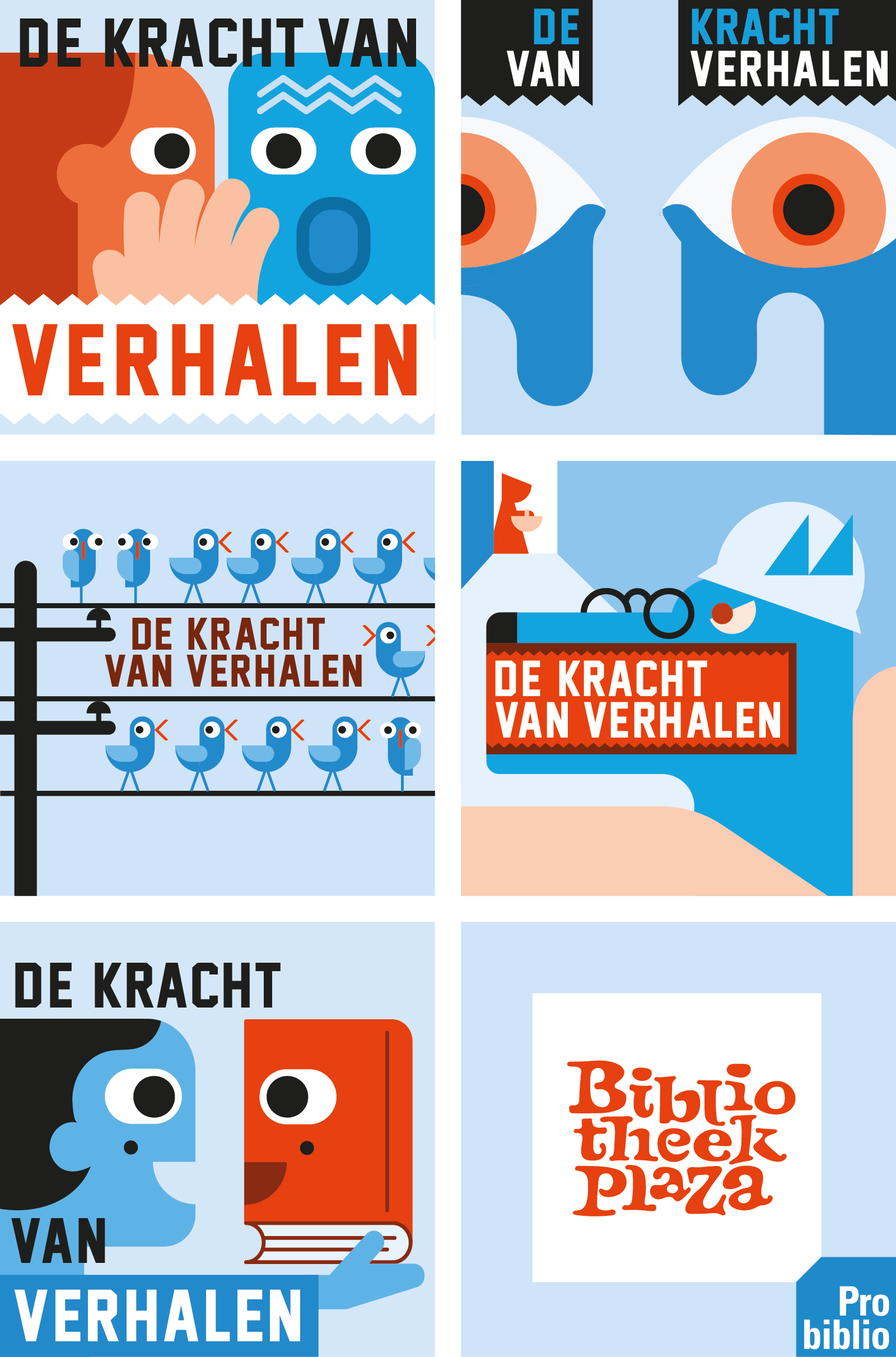
Een jaarlijks hoogtepunt is het landelijke congres Bibliotheek Plaza. Samen met copywriter Marcel Jiskoot hebben ik afgelopen vijf jaar het gezicht gegeven aan deze inspiratiedag.
–
Against illiteracy – Communication and campaigns for Probiblio
Probiblio is the organization that supports the libraries in the provinces of North and South Holland. For Probiblio I worked on all kinds of social themes related to literacy.
An annual highlight is the national conference Library Plaza. Together with copywriter Marcel Jiskoot, I have given the face to this inspirational day over the past five years.
Op een gebouw aan de Hilversumse Larenseweg prijkt het woord MELKFABRIEK, in bolle, bijna vloeiende letters, alsof ze op het punt staan over te lopen. Een streep eronder gaat de hoek om naar de voorgevel en leidt naar de ingang.
’s Avonds komt er een verrassing: in iedere letter verschijnt – verlicht – een andere letter. Samen vormen ze de tekst GOED VOOR ELK. Het is een knipoog naar een slogan uit de jaren vijftig (‘Melk, goed voor elk’), die in het collectieve geheugen staat gegrift.
De boodschap is duidelijk: de Melkfabriek borrelt bijna over. De Melkfabriek is goed voor elk. Overdag, ’s avonds en ’s nachts. Het bruist in het gebouw, dat tot 2005 is gebruikt om zuivel te produceren en in hetzelfde jaar werd uitgeroepen tot gemeentelijk monument. Inmiddels heeft Dudok Wonen het gerenoveerd en zijn er bedrijven, appartementen, een crèche, een basisschool en een buitenschoolse opvang. Er wordt gewoond, gewerkt, geleerd of gewoon even bijgekletst bij een cappuccino.
Op de voorgevel staat een losse letter M, die de werkdagen markeert. ’s Avonds verschijnt in deze letter de contour van een melkfles, die iedere dag voller wordt. Tot het weekend, dan is de fles leeg om op maandag opnieuw te worden gevuld.
Het ontwerp, tot stand gekomen in samenwerking met Studio Verreijt, doet recht aan het dynamische karakter van de Melkfabriek. Het is een kroon op het renovatiewerk en een cadeau aan het gebouw en zijn nieuwe gebruikers.
–
Object with a surprise – Facade object for a former dairy factory
The word MELKFABRIEK (dairy factory) adorns on a building in Hilversum, in convex, almost flowing letters, as if they are about to overflow. A line below goes around the corner to the front facade and leads to the entrance.
In the evening there will be a surprise: in each letter appears – illuminated – another letter. Together they form the text GOED VOOR ELK (good for each). It is a nod to a slogan from the 1950s (“Milk, good for everyone”), which is etched in the collective memory.
The message is clear: the Milk Factory is almost bubbling over. The Milk Factory is good for everyone. Daytime, evening and at night. The building is buzzing with life, which was used to produce dairy until 2005 and was declared a municipal monument in the same year. Dudok Wonen has now renovated it and there are companies, apartments, a crèche, a primary school and an out-of-school care facility. People live, work, learn or just chat over a cappuccino.
On the facade is a separate letter M, which marks the working days. In the evening the outline of a milk bottle appears in this letter, which becomes fuller every day. Until the weekend, then the bottle is empty to be refilled on Monday.
The design, created in collaboration with Studio Verreijt, does justice to the dynamic character of the dairy factory. It is a crown on the renovation work and a gift to the building and its new users.
Ook zonder concrete opdracht is mijn werk mijn hobby. Speciaal bij onderwerpen die mij aan het hart liggen. Zo heb ik na jaren luisteren naar Thom Yorke eindelijk iets terug gedaan en zijn portret gemaakt. Trump is daarentegen een antiheld en daarom zeker ook de moeite waard. Tijdens het maken van zijn portret kwam stiefdochter Liv (toen 7) even langs en zei enthousiast: ‘Oh leuk Erik, Obama!’
–
Free work – illustrations
Even without a concrete assignment, my work is my hobby. Especially on topics that are close to my heart. For example, after years of listening to Thom Yorke, I finally did something in return and made his portrait. Trump, on the other hand, is an anti-hero and therefore certainly worth it.
B&T, organisatie adviesbureau voor het onderwijs, zoekt talentvolle trainees in het onderwijs. Elke potentiële kandidaat is wel ergens een uitblinker in en zal zich herkennen in één van de profielen. Vanuit deze gedachte heb ik in samenwerking met Symen Veenstra verschillende uitblinkers uitgewerkt met aansprekende namen en korte triggerende copy. Dat zet in elk geval aan tot een sollicitatiegesprek; volgens B&T was het aantal sollicitanten 2,5 x zo hoog als normaal.
–
Turn on the interview – How to trigger your trainees
B&T, a consultant agency, is looking for talented trainees in education. Every potential candidate excels in something and will recognize himself in one of the profiles. Based on this idea, I have worked out several highlights with appealing names and short triggering copy in collaboration with Symen Veenstra. In any case, that encourages a job interview; according to B&T, the number of applicants was 2.5 times higher than normal.
Samen met Caspar Conijn hebben we een oorlogsmonument ontworpen dat aansluit bij de stijl van de historische route ‘Scherven van een stad’ die we kort daarvoor hebben gerealiseerd. Door de hele stad Coevorden staan nu monumentale objecten die tezamen die historie in beeld en tekst vertellen.
–
Memorable
Together with Caspar Conijn, we designed a war memorial that matches the style of the historic route ‘Shards of a city’ that we realized shortly before. Throughout the city of Coevorden there are now monumental objects that together tell that history in image and text.
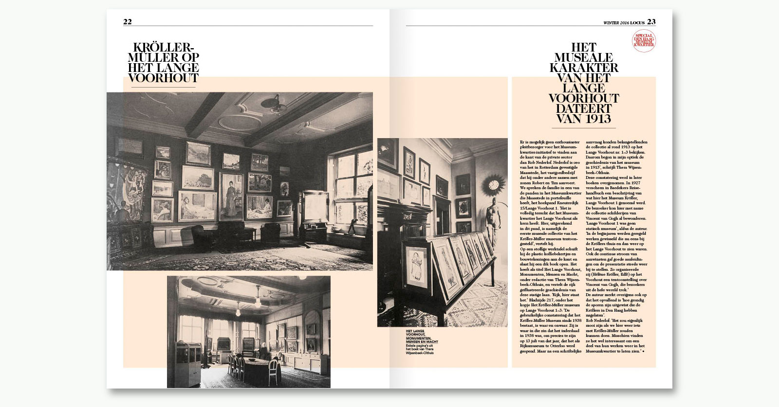
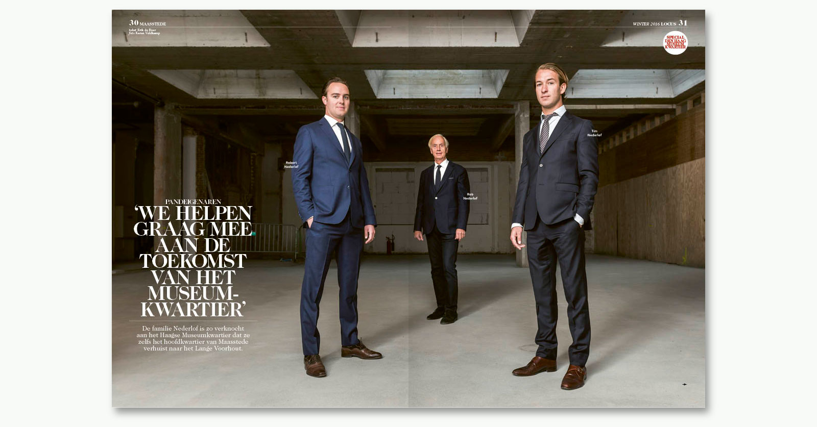
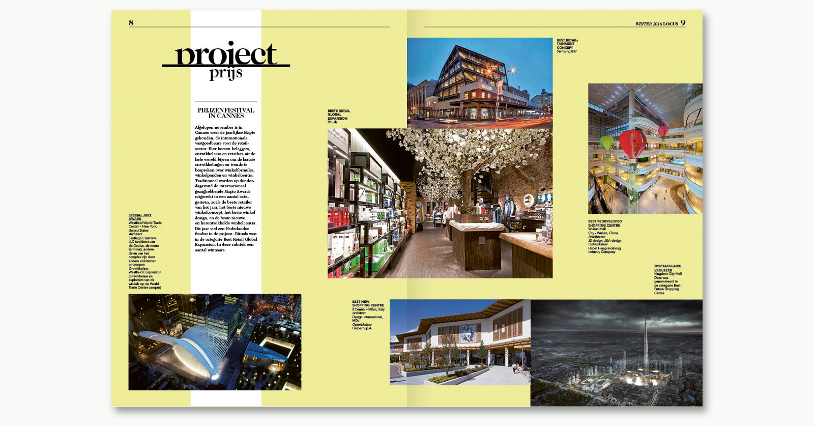
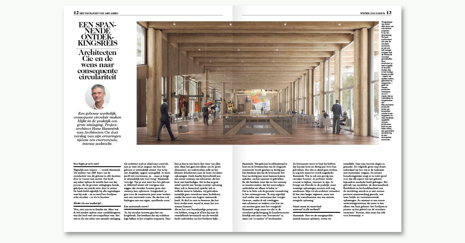
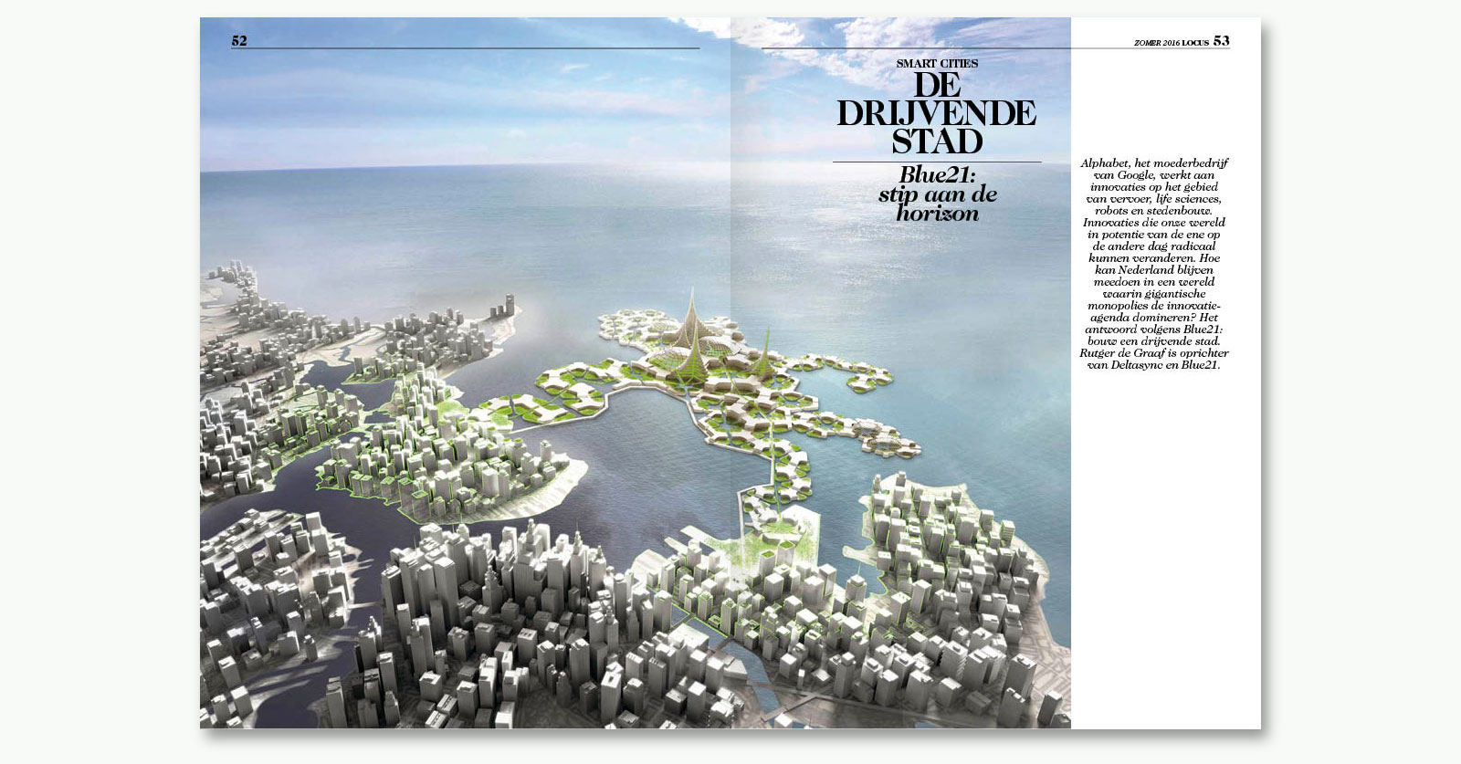
Samen met Judith Schoffelen hebben ik Locus gerestyled en zodanig in een totaal nieuw jasje gestoken: nieuw logo en lay-out. Locus is het magazine van PropertyNL over gebieden, gemeenten en gebruikers dat verschijnt als bijlage bij het Financieel Dagblad.
–
Focus – On Locus
Together with Judith Schoffelen I restyled Locus and gave it a completely new look: new logo and lay-out. Locus is PropertyNL’s magazine about areas, municipalities and users that appears as an appendix to the Financieel Dagblad.